Interior Styling
Published in Johnson County Lifestyle, September 2021
Have you ever pieced together an outfit for a special event or placed a collection of items on a shelf and then stood back and found that the pieces you pulled together totally worked or completely did not work? I used to think that I either needed a whole lot of talent or a bit of luck when it came to styling something beautifully. Turns out, there is no talent or luck about it at all. It all starts with a math formula (hang with me here!). This formula is known as The Golden Ratio of 1.618. Discovered in the ancient world by mathematicians, this pattern can be found all over in the world of nature. This ratio creates patterns that can be found on the spines of a pinecone, seeds on a sunflower head, spirals on seashell, even the human form- to name only a few. And our eyes love to see it. Why our eye likes this particular pattern may remain a mystery but how to achieve it is no mystery at all. Fashion designers, interior designers, architects, photographers and artists have all been using this formula for centuries in order to achieve visually appealing compositions. And so can you!
Let’s make a Vignette!
In interior styling, a vignette is a small, curated collection of objects grouped together to create a smaller picture within a larger space in a room. Chances are, at some point you’ve put together a vignette without knowing it was one. What makes the difference between a purposefully styled vignette and a cluttered collection is all in the composition. The composition is most appealing when this amazing Golden Ratio is applied. Here you will find some practical tips on how to apply the Golden Ratio when styling a vignette in your home. And because these tips have to do with what our eye likes to see, it can be applied to any interior style from modern to farmhouse, traditional to boho and beyond.
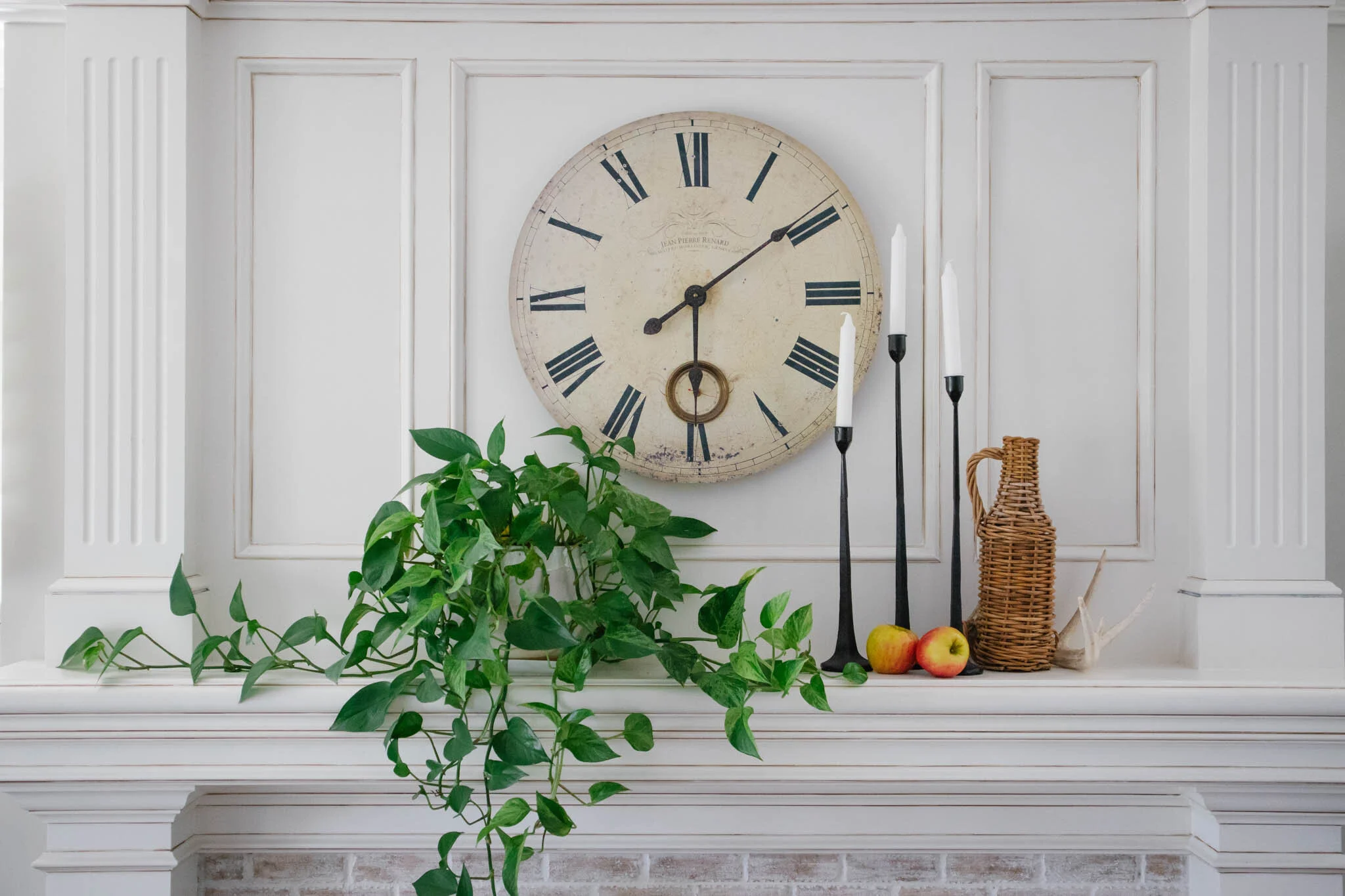
To get started on styling a vignette, first decide on the space you’ll place it. It could be an empty shelf, bedside table, or coffee table. Next, collect a few of your very favorite things that could be styled there. These objects could be a few books, a vase with flowers, a candle, a small clock, a plant, a few apples, the list is endless. Simply choose objects that are meaningful to you or that you think are interesting or beautiful. My challenge to you is to not go and buy anything new. What you have is enough even if it's going to the frig for a couple of apples, like I did here. Now that you have your space and objects to style, it's time to assemble your vignette...
Get in line! {Where to place objects}
In grid form, the Golden Ratio shows designers exactly where to place the most important objects in the composition for the greatest visual appeal. Known as Phi, this grid splits the space that you’re working with into thirds vertically and horizontally. To apply to your vignette, place the most important objects on the correlation grid lines. Even better, on the points where the lines intersect. This will be more appealing to the eye then if the important objects are in the center of the frame or far to the sides.
Follow the Flowers {How many objects to use}
In number form, the Golden Ratio helps us to know how many items to use when styling a vignette. This form is known as the Fibonacci Sequence (0, 1, 1, 2, 3, 5, 8, 13, 21, 34, etc.). The sequence grows as it adds together the prior 2 numbers to get a new number (for example, 3+5=8 and 5+8=13, etc) and repeats. Amazingly, all the numbers that you achieve by doing this are the exact same numbers of petals that are found on flowers. How amazing is that! To apply to styling a vignette, choose a number in the Fibonacci Sequence for the number of items you will use to style. Typically 3 or 5 objects work great for small vignettes.
Frame & art created by my friend Lindsey over at @weatheredwoodhome
Step Down or Triangle {What shape to create}
The eye loves to see odd numbers. Odd numbers stop our brain from categorizing items into pairs which are less visually interesting. When styling a vignette, build a triangle shape of 3 points with the objects you are styling. To achieve this, vary the heights of objects to make a stepping down effect. If your items are of similar height then use books or a small object to lift one higher so that it appears taller than the others. To start, place the tallest piece in the back, medium piece in front and slightly to the side of the tall piece, then the smallest piece in front to create a stepping down effect. The Golden Triangle has angles of 72 and 36 degrees but any triangle here will do!
Layers upon layers {How to place objects}
Avoid straight lines when styling a vignette. Three objects placed side by side is far less interesting than if they are slightly overlapped (literally or visually). Layer objects in order to give them a sense of belonging together, as random of a collection as they may be. Layering can also be achieved by mixing textures (woven basket, shiny glass and organic leaf).
To Mix or to Match {How to choose objects}
Decide ahead of time if your vignette will be a mixture of items or a single themed collection. If you’re mixing (such as using a vase, a plant, and a candle) then make sure your objects all have a commonality either of color, texture or form. If you’re going with matched items (such as all white candles) then take extra care to use odd numbers and varying heights for visual interest.
I hope you have fun creating your vignette and share them with me over on IG @silvertoothhome. Happy styling!


